

")


: High-Quality Templates for Creatives")

Learn how to design finger-friendly interfaces for mobile apps and websites. Improve usability, accessibility, and user experience with touch-friendly buttons and layouts.
Finger-friendly UI, mobile UX design, touch-friendly interface, mobile usability, thumb-friendly design
Tap targets, touch gestures, mobile accessibility, user-friendly mobile design
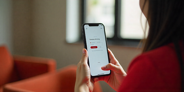
Why Finger-Friendly UI Design Matters
In today’s mobile-first world, fingers are the main tool users interact with. Finger-friendly UI ensures that users can tap, swipe, and navigate comfortably without frustration.
Key takeaway: Making your mobile interface touch-friendly increases user engagement, reduces errors, and improves overall mobile usability.
Designing for Thumb Reach and Comfort
Most users navigate smartphones using their thumbs. To create a thumb-friendly design:
Place primary actions at the bottom of the screen for easy reach.
Avoid placing important buttons in upper corners, which are harder to reach.
Consider the natural arc of thumb movement when designing layouts.
UX studies show that bottom-reachable areas significantly improve task completion rates and reduce user frustration.
Minimum Touch Targets for Buttons and Links
To ensure accurate tapping:
Use buttons that are at least 44×44 pixels (~7–10 mm).
Leave sufficient spacing between interactive elements to prevent accidental taps.
Make touch targets larger for users with motor impairments or larger fingers.
Large tap targets enhance mobile accessibility and make your interface more user-friendly.
Principles of Finger-Friendly Mobile UX
Adequate Tap Size – Ensure all interactive elements are big enough to tap comfortably.
Feedback on Interaction – Visual or tactile feedback helps users know their actions are recognized.
Avoid Cluttered Interfaces – Focus on core features, reduce unnecessary elements, and keep screens clean.
Consistency – Keep button size, spacing, and placement consistent across screens.
Best Practices for Touch-Friendly Mobile Design
Use Gestures: Integrate swipes, pinches, and taps to enhance navigation without relying solely on buttons.
Spacing: Ensure enough space between elements to prevent mis-taps.
Accessibility: Always account for users with larger fingers or motor difficulties.
Visual Hierarchy: Highlight primary actions and minimize secondary options to reduce cognitive load.
Conclusion: Why Finger-Friendly Design Matters
Designing for fingers isn’t just a guideline—it’s a user-centric approach to mobile UX. By applying touch-friendly principles, your app or website will:
Improve mobile usability
Reduce user errors
Increase engagement and retention
Creating a finger-friendly UI is a small design investment that leads to big results in user satisfaction.
Discover more from DesignRise
Subscribe to get the latest posts sent to your email.


